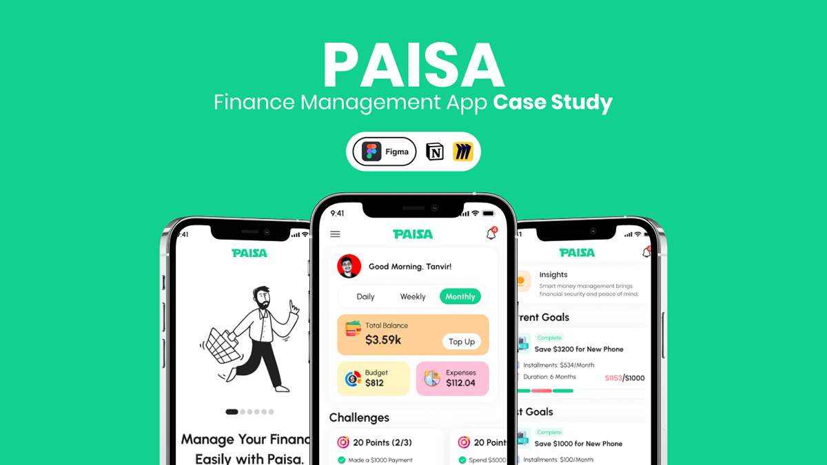
Goal : Make a user-friendly solution which allows student to manage their monthly finances and help them to achieve their long time financial goals.
Year: 2024 | Client: Personal Project
Introduction
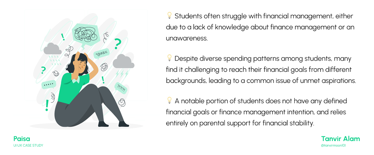
Efficiently managing money is essential for achieving success in life. However, numerous individuals, particularly university students, face challenges when it comes to their finances. The objective of this project is to create a solution for this widespread issue by simplifying financial management for individuals.
Problem Statement
Many struggle with money management, leading to financial problems. Poor planning often results in running out of money before the month ends. Students are particularly affected, as it hinders their ability to meet daily expenses and achieve long-term financial goals. It's crucial to acknowledge the challenges people face in managing their financial responsibilities.
Solution
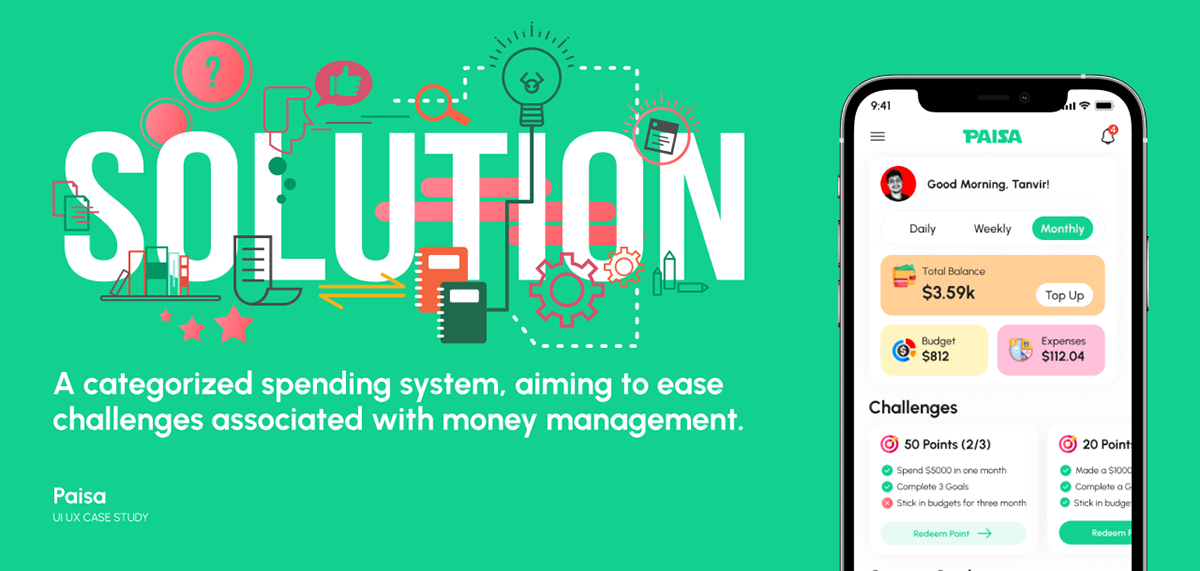
To solve the issue, I decided to develop an app. It will help students manage their finances by categorizing spending.
My Role and Duration
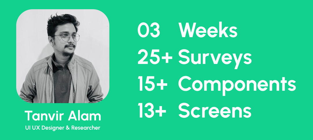
This is an independent Case study. I work as a UX designer, focusing on creating user-friendly finance management solutions. As a solo project, I handled all aspects to achieve the project's goal. The case study took three weeks, with 8 days dedicated to user research.
User Research
Identification of problem+Users
White Paper Research
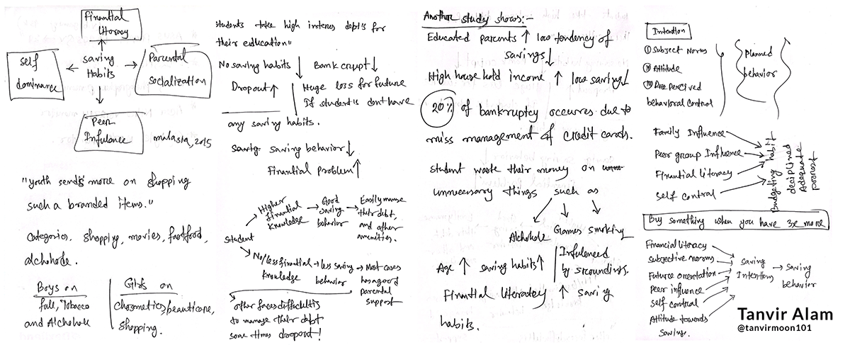
To initiate the project, I commenced brainstorming and delved into various research articles to comprehend people's saving habits and behaviors. During my research, I discovered that expenditure and saving habits vary across cultures and genders. Each group tends to allocate a specific amount to categorize, they prioritize in their spending. Another study from shows that, 20 of bankruptcy occurs due to miss management of credit cards in Malaysia (Salikin, N,. et. al. 2012).
Here is a snapshot of my notebook during the white paper research process.
------------------------------------------------------------------------------------------------------------------------
1. Salikin, N., Wahab, N. A., Zakaria, N., Masruki, R., & Nordin, S. N. (2012). Students’ saving attitude: does parents’ background matter. International Journal of Trade, Economics and Finance.
User Interview & Questioner
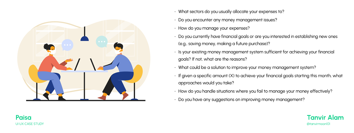
I learned about user behavior through interviews and surveys, focusing on money management habits. Many don’t show much interest in financial planning, leading to month end struggles. I also surveyed students from various fields, asking questions
such as:
Analyzing the data
Processing + Analyzing data
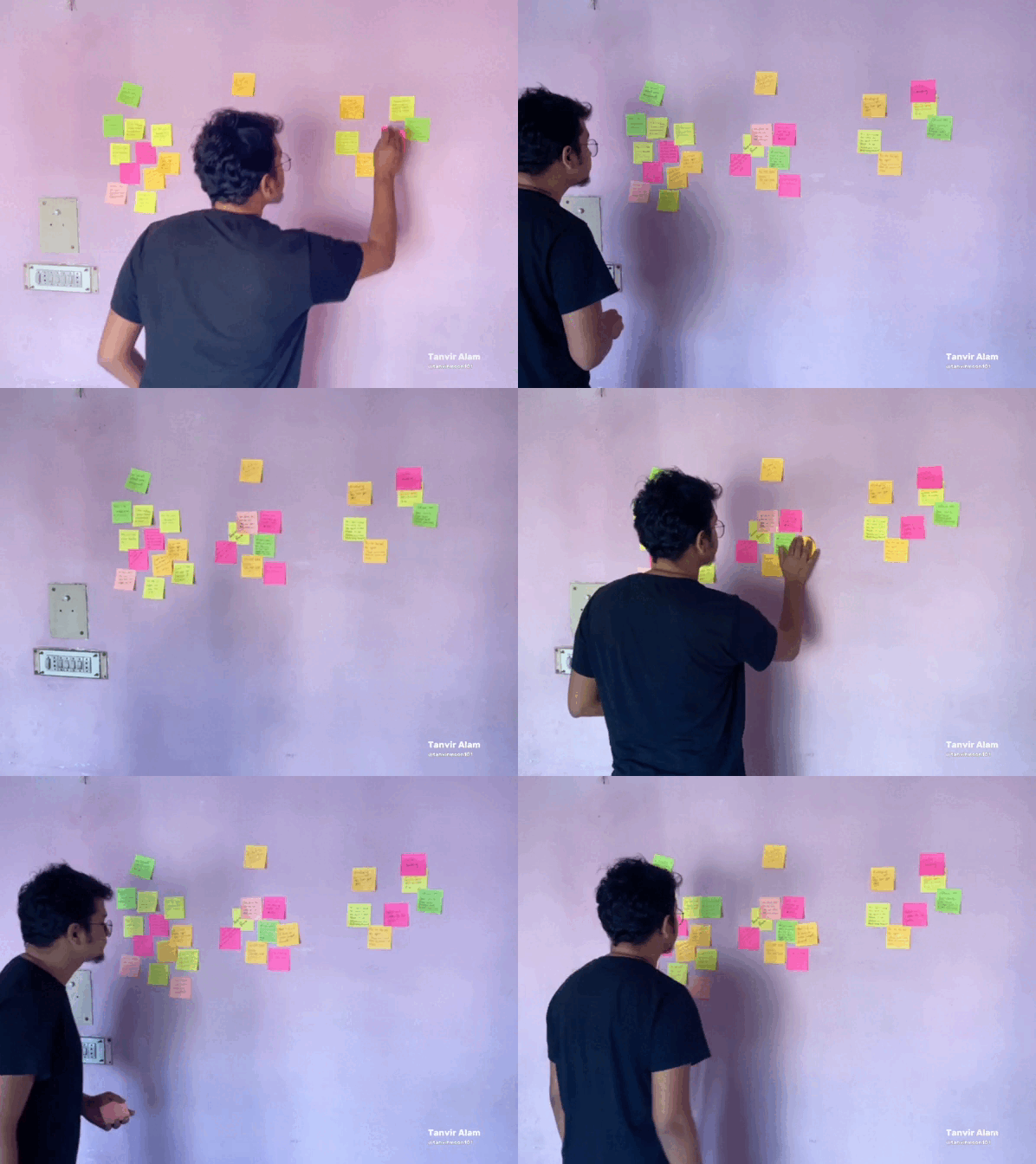
To analyze the qualitative data obtained from the survey, I employed the card sorting technique, systematically organizing and categorizing information. 😅😅
While engaging in discussions with users, I discovered that this issue significantly impacts users, causing considerable distress. The following quotes encapsulate their experiences.
Some Quotes from users'
"I allocate my expenses to essentials like tuition, food, and rent, but it's always tight."
"Managing expenses is tough; I try to budget, but unexpected costs throw me off."
"Yeah, I encounter money issues, especially when textbooks or unexpected bills pop up
"My financial goal is to save money for a post-graduation trip."
"My money management isn't cutting it; emergencies wipe out whatever little I manage to save."
"To improve, I plan to set stricter limits on non-essential spending during busy study periods."
"If given a specific amount, I would allocate it proportionally to savings, education, and leisure."
"When I fail to manage money, I review my budget and cut back on unnecessary expenses for the next month."
"My suggestion is to have periodic check-ins and reminders within the app to stay on track."
User Persona + Empathy Map
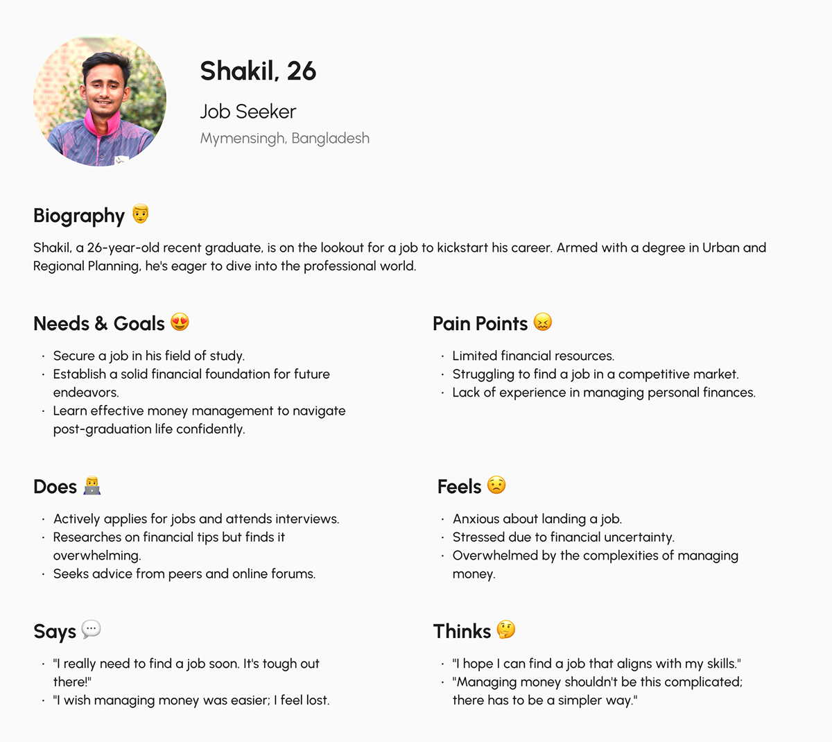
After analyzing the interviews and survey responses, I crafted a user persona and empathy map that vividly represents our typical user. It was fascinating because it helped me understand exactly what challenges our users are facing. Now, I'm using this info to come up with solutions that will make things better for them.

Thinking Solution
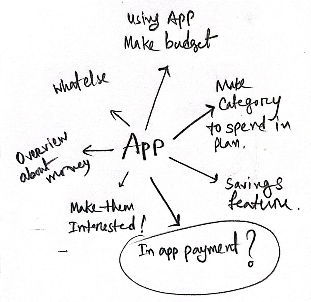
Considering the overall scenario, I revisited the traditional method of pen and paper to formulate the optimal solution for my design. After a thorough exploration and iteration process, This represents the final idea I arrived at.
User Story
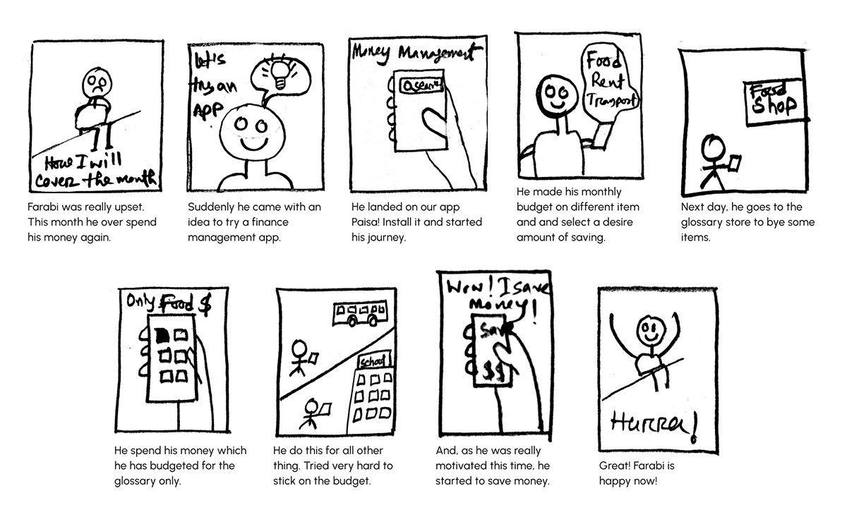
I began by sketching user stories, outlining the tentative scenarios that our users might encounter while using the application. Through this exercise, I aimed to visualize the various situations and understand the emotions our users may experience during their interaction with the solution.
Competitor Analysis
To comprehend the prevailing market landscape, I conducted a thorough competitor analysis, testing various apps offering similar solutions. The findings revealed a gap – no dedicated app combines all-encompassing solutions for the current scenario. Many existing apps rely on manual expense entry with subpar UI. A comparative study, including Paisa, showcased notable distinctions, emphasizing the need for an efficient, user-friendly solution.

User Flow
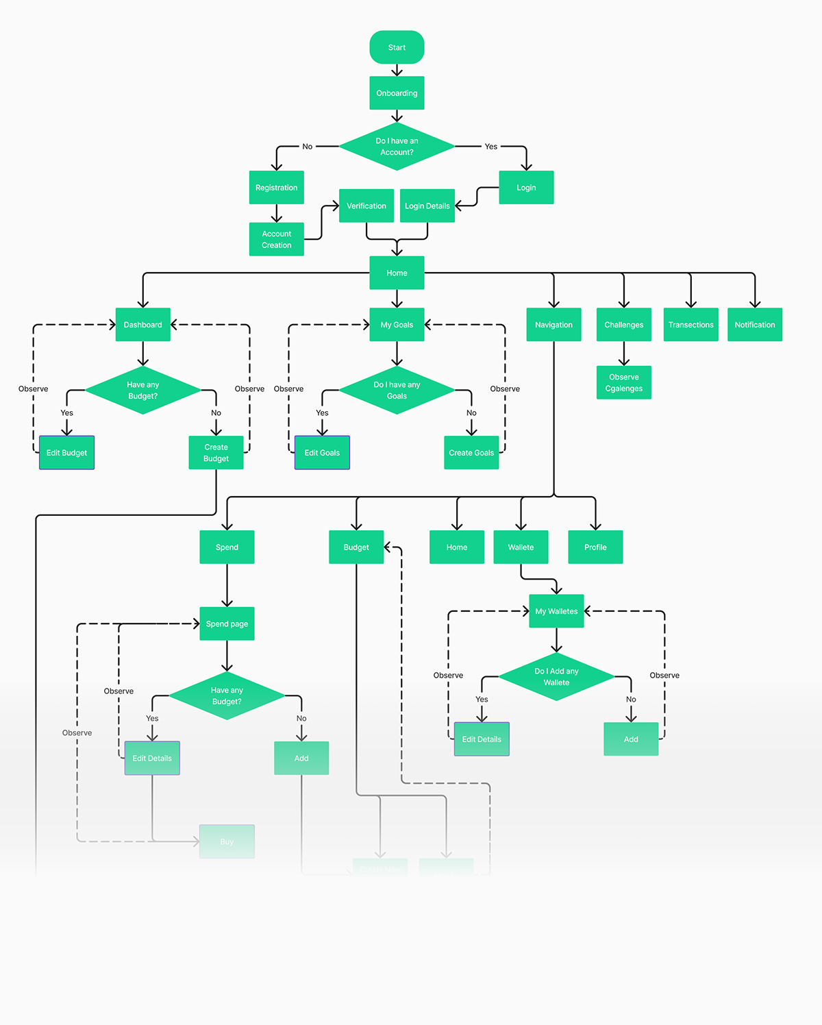
Next, my focus shifted to understanding how users would interact with our app. To achieve this, I meticulously crafted a user flow, envisioning the seamless journey users would embark on while exploring various features. Just like a roadmap, the user flow delineates the path users follow from the initial engagement to the final interaction, ensuring a clear and intuitive navigation through our website or app.
Information Architecture
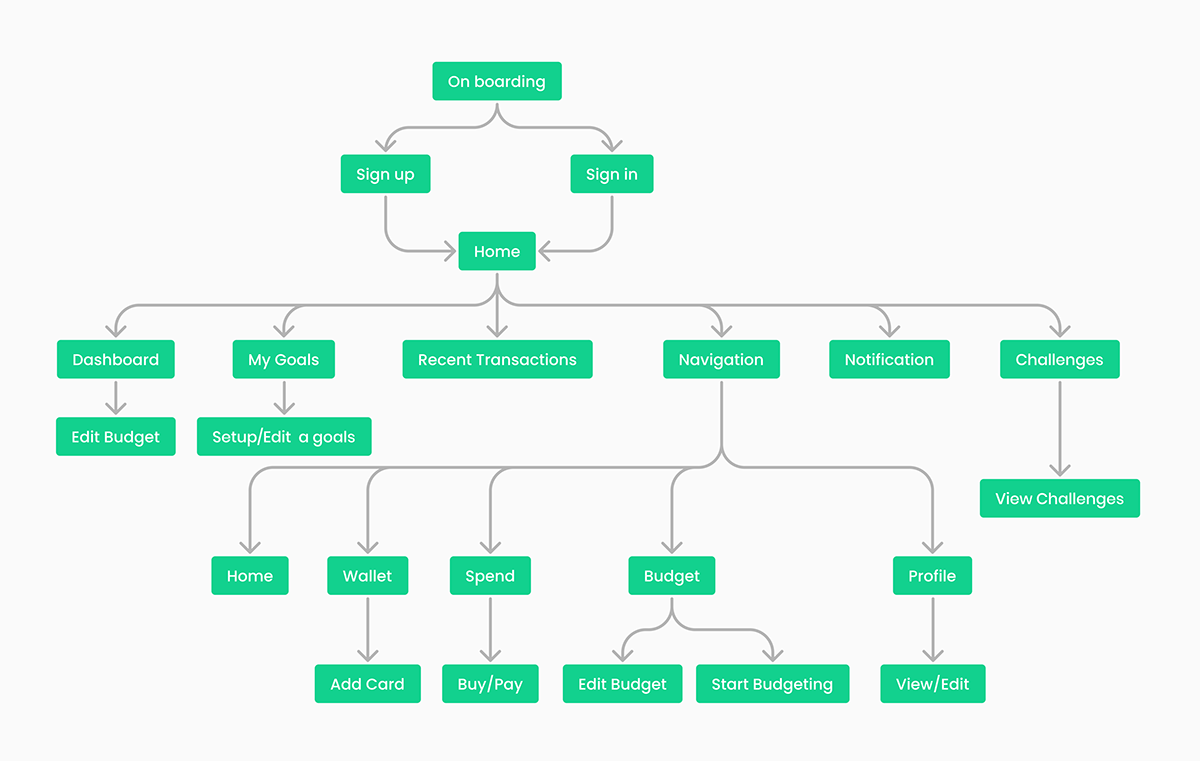
To organize all the information about the app in one frame, I started crafting the information architecture of the app. It was fascinating for my, because at this stage I started to imagine how my app will look like!
Wireframes
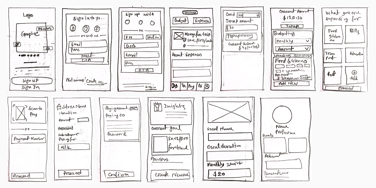
After finalizing the information architecture, I began crafting the basic version of my mobile app through paper sketches. I tackled various challenges by exploring different solutions, and ultimately, I formulated the ideas that are systematically outlined here.
Design Decisions and Iteration
A/B testing+Iteration
While brainstorming ideas, I gathered feedback from friends on my sketches. Their input helped me choose the best option through A/B testing. This is an example, where users showing a preference for the second option as feature. It’s time to design… 😎

First Iteration
After that, more design decisions were made, and UI improvements were applied to enhance the spending category page. I carefully considered several factors during this iterative process.

Second Iteration
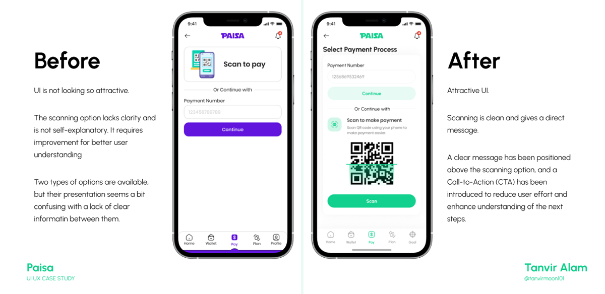
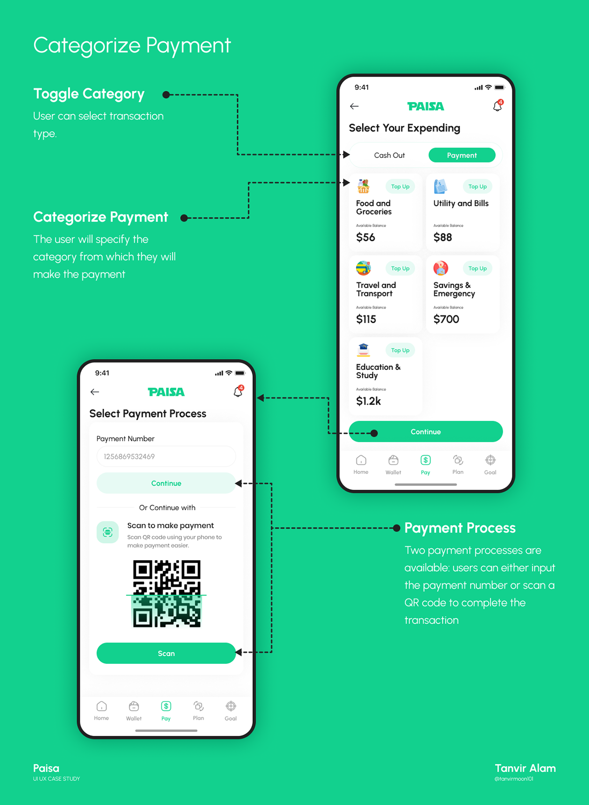
An additional design decision was implemented on the select payment process page, introducing a clearer concept of the process.
Design
Style Guide+ UI
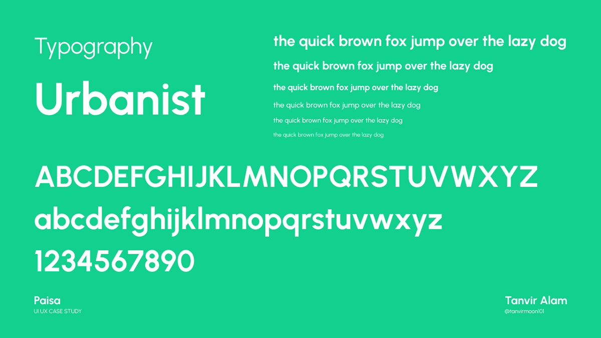
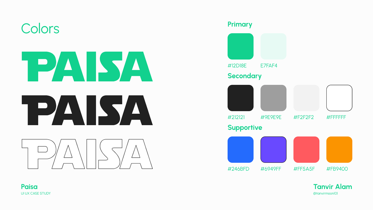
I have used Urbanist as the font for my design. Green has been selected as the primary color.


Design Explanation
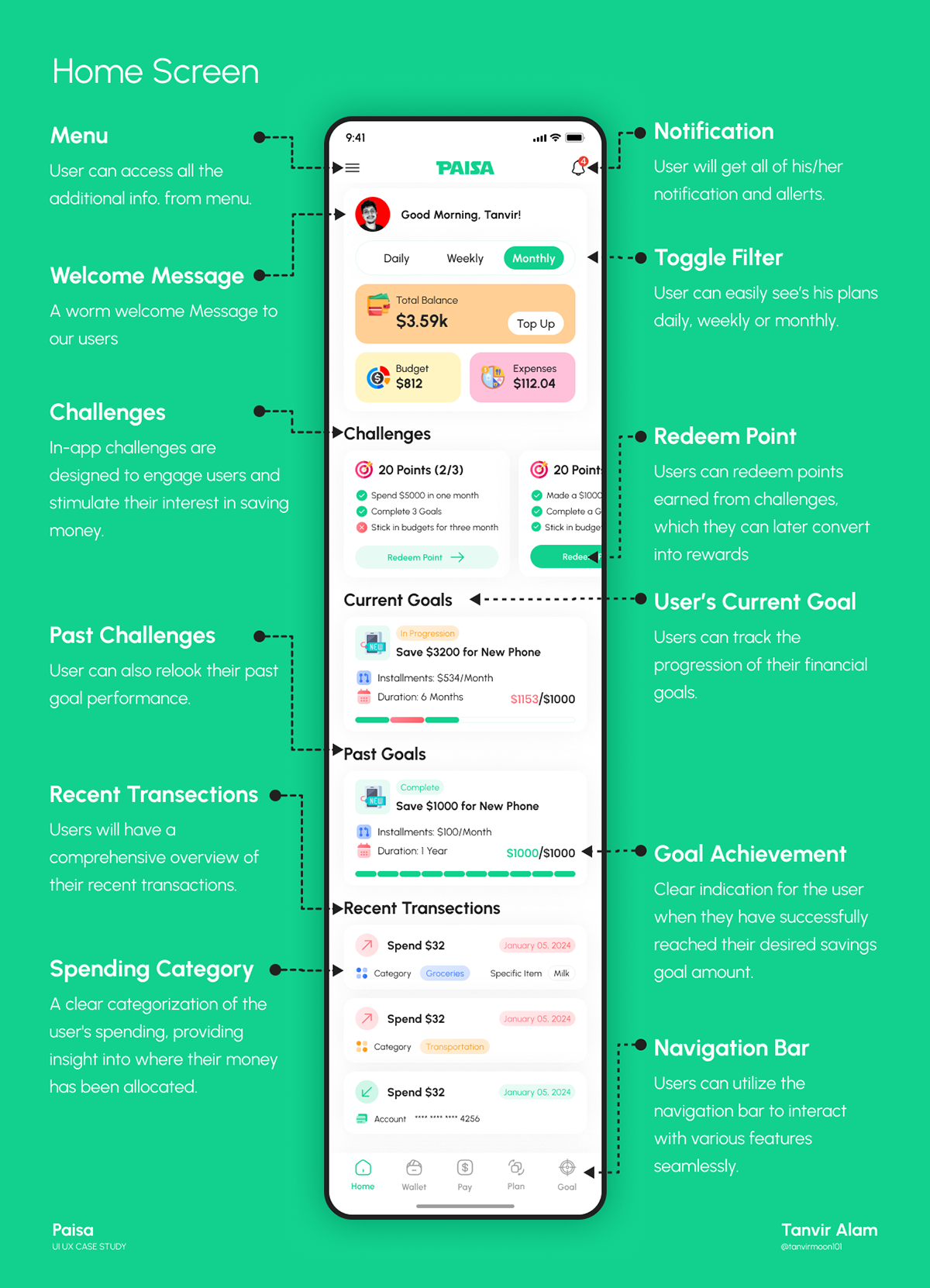
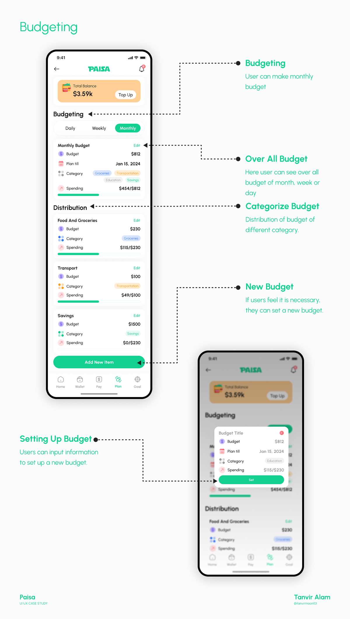
All the elements of the home screen are discussed below. During the design process, I made an effort to ensure that everything is user-friendly and meaningful to the users.
Prototype
To provide a tangible experience of the product, I have successfully prototyped it using Figma. Please take a moment to explore the app and its interactions.
Final Designs
These are the final screens of the app. Feel free to fully immerse yourself in them.


Thank you for taking the time to scroll this far! 🙏
Let’s create something together. Send me email at
tanviralam.ruet@gmail.com


